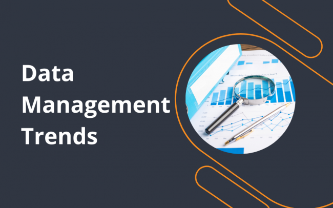
Tabulated reports can overwhelm audiences and crowd your presentation slides. Instead, incorporating geometric shapes, colors, photos, and animations provides ease of comprehension and aesthetic impact. So, data visualization will help you explain complex trends to diverse audiences. This article will discuss data visualization techniques for effective communication.
What is Data Visualization?
Data visualization means developing graphics and geometric shapes to depict different trends in corporate datasets. Conventionally, professionals would manually create pie charts, histograms, bar charts, and scatter plots. Today, data visualization services offer built-in automation tools, allowing users to accelerate report creation based on a company’s requirements and target audiences.
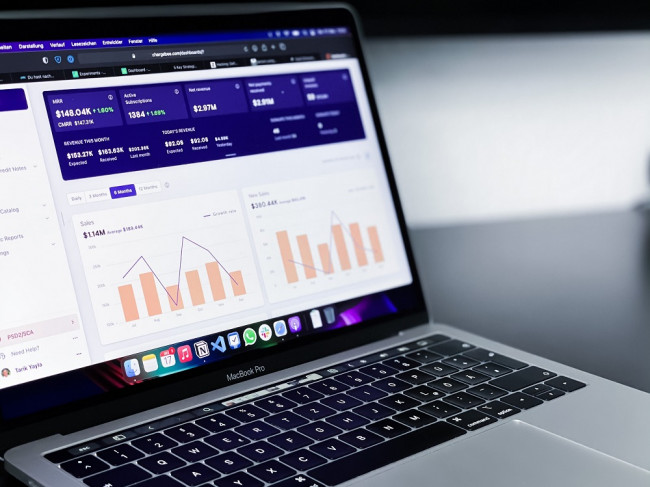
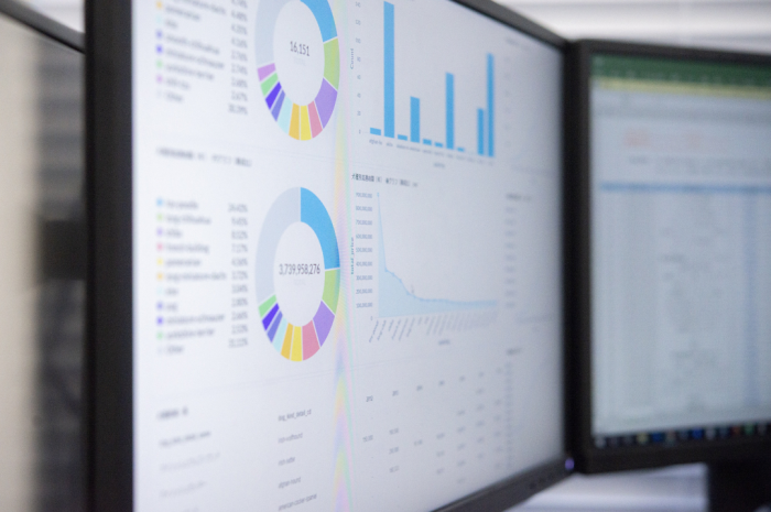
Across academia to newspapers, line graphs and pie charts are preferable reporting visuals. Meanwhile, data streaming, healthcare, and transportation companies leverage real-time data visualization powered by animated dashboards.
Advancements in word processing software, scalar vector graphics (SVGs), and HTML5 videos create visual elements without increasing file sizes. Moreover, thanks to improved compression ratios and faster web connectivity, three-dimensional charts have become more feasible and universally accessible.
Simultaneously, data visualization technologies must maintain mathematical precision to avoid potential misunderstandings during reporting.
What Are the Techniques of Effective Data Visualization?
Companies procure automation-friendly data visualization software to optimize their overall efficiency. Later, professionals use them to transform data into captivating visuals. For example, they will tell an engaging story to explain audience trends when offering marketing analytics consulting.
A data visualization workflow involves geometric elements and color-coded designs. Besides, freeform shapes can help highlight points of interest and direct audiences’ attention to specific reporting elements.
Reliable data visualization and business intelligence reporting tools ensure mathematical integrity and logical arrangement of shapes. They provide precision across textual labels, photos, and color spectrum customizations. Also, you can scale digital elements using design software and coding skills for publishing consistent documentation.
Depending on the main elements, you can classify data visualization techniques in the following manner.
1| Bar Charts
Bar charts show the distribution of corporate data. Businesses use them to indicate data over time, comparisons, and the relative size of data. Also, these elements highlight the relative frequency of data. For example, assume you seek insights into seasonal price variation in the last year. In this case, you will find it easier to visualize relevant data as bar charts than to decipher numerical tabulation.
Additionally, comparative analysis of multiple metrics for pattern discovery is achievable with combined bar charts. However, bar chart visualization is ideal for discrete data or whole-numbered quantities. If you want to study fractional or continuous data range, a bar chart might not be suitable.
2| Line Charts
Line charts visualize the trends over time. So, companies employ them in the comparisons between two or more datasets. For example, a line chart compares the sales revenue in three separate months: September, October, and November.
You can use them to observe the relative increase in continuous data. If continuity in the dataset is irregular, you need more data to make line graphs consistent. Therefore, businesses must utilize interpolation to resolve the missing data issue. Line graphs are more valuable since the representation of continuous data does not work well with bar chart visualization. After all, you want to retain decimal values in the reporting chart.
3| Scatter Plots
A scatter plot visualization illustrates the essence of the association between two varying quantities. Each variable corresponds to the x and y axes while appearing as an isolated data point. You can also connect them by a trend line or association line. So, the length of these links outlines the difference. Otherwise, grouping the data points based on their density will help separate the most frequent values from rare readings.
Companies pick scatter plot visualization techniques to find a correlation or causation between two variables. They also employ data analytics and linear regression to affirm their results. Furthermore, scatter plots help teams locate the outliers or abnormally high values.
They are appropriate when responding to specific inquiries about individual datasets. Regardless, do not use a scatter plot to solve the queries in a broad study involving several metrics.
4| Pie Charts
Pie charts are advantageous in displaying the breakdown of percentage contribution in a complete observation set. Additionally, they are easy to understand and explain. A pie chart visualization streamlines comparing different processes based on their contribution to the 100% objective culmination.
The main drawback with pie charts is that they only show one data element at a time. So, leaders ask for multiple pie chart visualizations depicting distinct data segments.
Inexperienced employees might underestimate the importance of using multiple pie charts. Therefore, they crowd their reporting views by putting all data in a single chart. However, everyone must specify the most remarkable pie chart with the greatest diameter.
Other components deserve their dedicated pie charts or slides. Related size variation assists in clarifying priorities and is known as a visual hierarchy in design.
5| Flow Maps
Flow map visualization is a diagram portraying the movement of people or resources. As a result, they show patterns of information transfer and resource consumption. Flow mapping is a powerful element in effective data visualization to analyze how people interact with each other, their surroundings, and the products they use.
For example, data analysts create online marketing reports and mention the user traffic flow between the web pages on business sites. Later, site owners can see audience retention per page to optimize user experiences and engage the visiting users longer. In other words, the analytics administrator considers the sequence of this user journey using flow map visualization.
Effective Data Visualization Techniques – Honorable Mentions
New visual formats emerge each year with novel design philosophies and mathematical research. Choropleth maps show population density superimposed on a geographic map using colors. On the other hand, a Cartogram map involves size variation or deliberate distortion for comparative studies.
Likewise, tree maps showcase the relationship between categories, describing authority, classification, and dependence levels. Adding statistical data to a tree map for visualization becomes useful for comparative and investigative exploration.
Live or real-time visualization features design assets that animate changes in metrics corresponding to live dataset updates. Additionally, animations can make switching between reporting sections more entertaining.
Finally, artificial intelligence (AI) and chatbots can revolutionize data visualization by offering ad-hoc reporting assistance.
Conclusion
Data visualization is an essential component of the modern business correspondence. It can help you find problems and communicate solutions to enhance decisions. Nevertheless, the variety of visualization elements might overwhelm you when deciding your reporting standards.
Remember, each approach offers some benefits alongside limitations. So, you want to be familiar with many data visualization techniques for effective communication. The core values of an effective design are simplicity, clarity, and elegance. Therefore, your data visualization providers must embrace them throughout the report creation.
Also, recognize that the future of data visualization lies with extensive automation and live data streaming. Consider how conversational AI might be the next-gen interface to craft robust graphs in a few seconds. Since data visualization standards will reflect these trends, you must prepare for them soon.